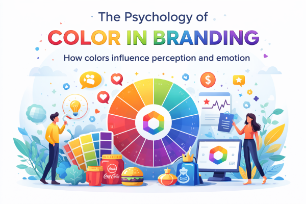
The Psychology of Color in Branding
Color is one of the most powerful tools in branding and marketing. Before a customer reads a word, understands a message, or experiences a product, they notice color. In fact, color can influence perception, emotions, and even purchasing decisions within seconds. This is why choosing the right colors for a brand is not simply a matter of aesthetics—it is a strategic decision that can define how a business is perceived by its audience.
Understanding the psychology of color in branding can help businesses create stronger emotional connections, improve brand recognition, and communicate their values more effectively.
Why Color Matters in Branding
Color has the ability to trigger emotional and psychological responses. Different colors can evoke different feelings, associations, and behaviors, often subconsciously. When used correctly, color helps businesses:
- Capture attention
- Build emotional connection
- Increase brand recognition
- Communicate personality
- Influence buying decisions
Studies have shown that people form a first impression of a brand in just a few seconds, and much of that impression is based on visual appearance—especially color.
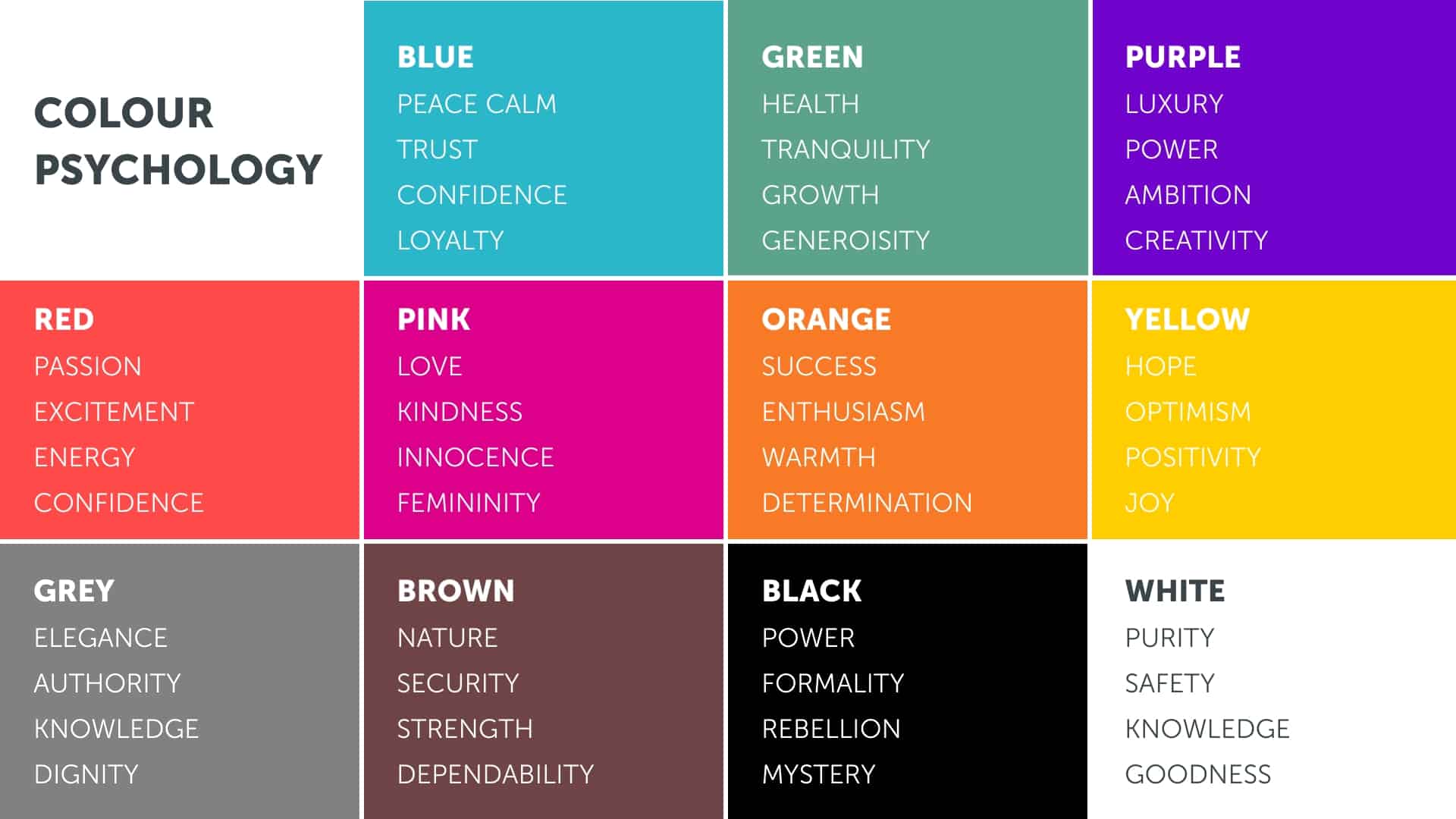
What Different Colors Represent
Each color carries its own psychological meaning and can influence how customers perceive a brand.
Red – Energy, Passion, Excitement
Red is bold, powerful, and attention-grabbing. It creates a sense of urgency and stimulates excitement. Brands often use red to communicate passion, strength, and confidence.
Red is commonly used in:
- Food industry
- Sports brands
- Entertainment
- Sales promotions
Blue – Trust, Professionalism, Security
Blue is one of the most popular branding colors because it creates feelings of trust, reliability, and calmness. Many corporate and technology companies use blue because it communicates professionalism and dependability.
Blue is commonly used in:
- Corporate businesses
- Technology companies
- Financial institutions
- Healthcare
Yellow – Optimism, Happiness, Creativity
Yellow is bright, energetic, and cheerful. It grabs attention quickly and often creates feelings of warmth and positivity.
Yellow is commonly used in:
- Creative brands
- Children’s products
- Lifestyle brands
- Food businesses
Green – Growth, Nature, Health
Green is associated with balance, freshness, nature, and sustainability. It is often used by brands that want to communicate wellness, eco-friendliness, or growth.
Green is commonly used in:
- Organic brands
- Health and wellness
- Environmental businesses
- Finance industries
Black – Luxury, Elegance, Sophistication
Black communicates power, elegance, exclusivity, and luxury. It creates a premium and modern feeling when used in branding.
Black is commonly used in:
- Luxury brands
- Fashion industry
- Premium products
- Minimalist design brands
Orange – Confidence, Energy, Friendliness
Orange combines the excitement of red with the positivity of yellow. It often feels youthful, energetic, and approachable.
Orange is commonly used in:
- Startups
- Fitness brands
- Creative businesses
- Call-to-action marketing
Choosing the Right Color for Your Brand
Selecting a brand color should not be based solely on personal preference. Instead, businesses should consider:
Target Audience
Different demographics respond differently to color. What appeals to one audience may not appeal to another.
Brand Personality
A serious financial company should not communicate the same way as a playful children’s brand. The color palette must reflect the brand’s identity.
Industry Standards
While standing out is important, understanding industry color trends can help align customer expectations.
Brand Message
Every color should support the story and values the brand wants to communicate.
Color Consistency Builds Recognition
Using consistent brand colors across websites, social media, packaging, and marketing materials strengthens recognition and builds trust. Over time, customers begin associating certain colors directly with a brand.
Think of some of the world’s biggest companies—many are instantly recognizable just by their signature color palette. This shows how powerful consistent color branding can be.
Final Thoughts
Color is far more than decoration in branding, it is a communication tool. It shapes first impressions, influences emotions, and helps businesses tell their story without saying a word.
Choosing the right color palette can strengthen a brand’s identity, make it more memorable, and create a deeper connection with customers. In today’s competitive market, understanding the psychology of color is essential for any business looking to build a strong and impactful brand.
Because in branding, every color sends a message and choosing the right one can make all the difference.


 Branding Color Psychology Marketing