

 RESEARCH
RESEARCH
For the Aquabike World Championship, the project began with research into the communication needs of an international watersport series. Since the events take place across Europe, Asia, and the Middle East, it was important to understand how the visual identity would function in different cultural contexts and event environments. The research focused on motorsport and watersport visual language, sponsor visibility, and how graphics needed to perform across digital platforms and large-scale event spaces such as paddocks and race venues.
DESIGN
DESIGN
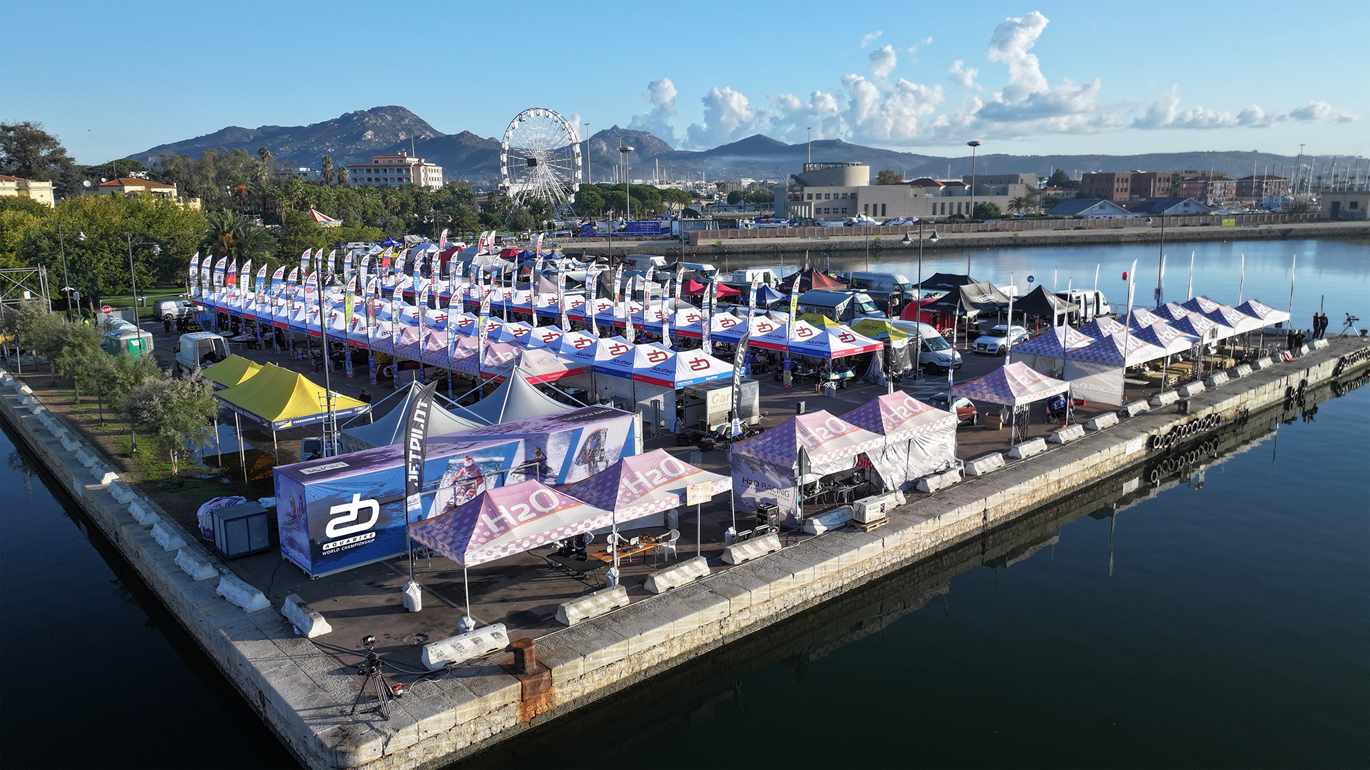
Based on these insights, I developed a dynamic and adaptable visual system for the championship. The design work included graphics for web and social media, promotional visuals for race events, and paddock materials such as flags, banners, and signage. I also designed editorial layouts for magazines and graphics for official merchandising. The goal was to create a strong and recognizable visual identity capable of communicating the speed, energy, and international nature of Aquabike racing.
DEVELOPMENT
DEVELOPMENT
In the development phase, the designs were translated into final production assets for multiple formats and environments. Each element was optimized depending on its application — from digital content used online to large-format prints for race locations and paddock installations. The result was a cohesive graphic system that supported Aquabike events worldwide, ensuring consistent communication across web, social media, event spaces, and merchandising.