

 RESEARCH
RESEARCH
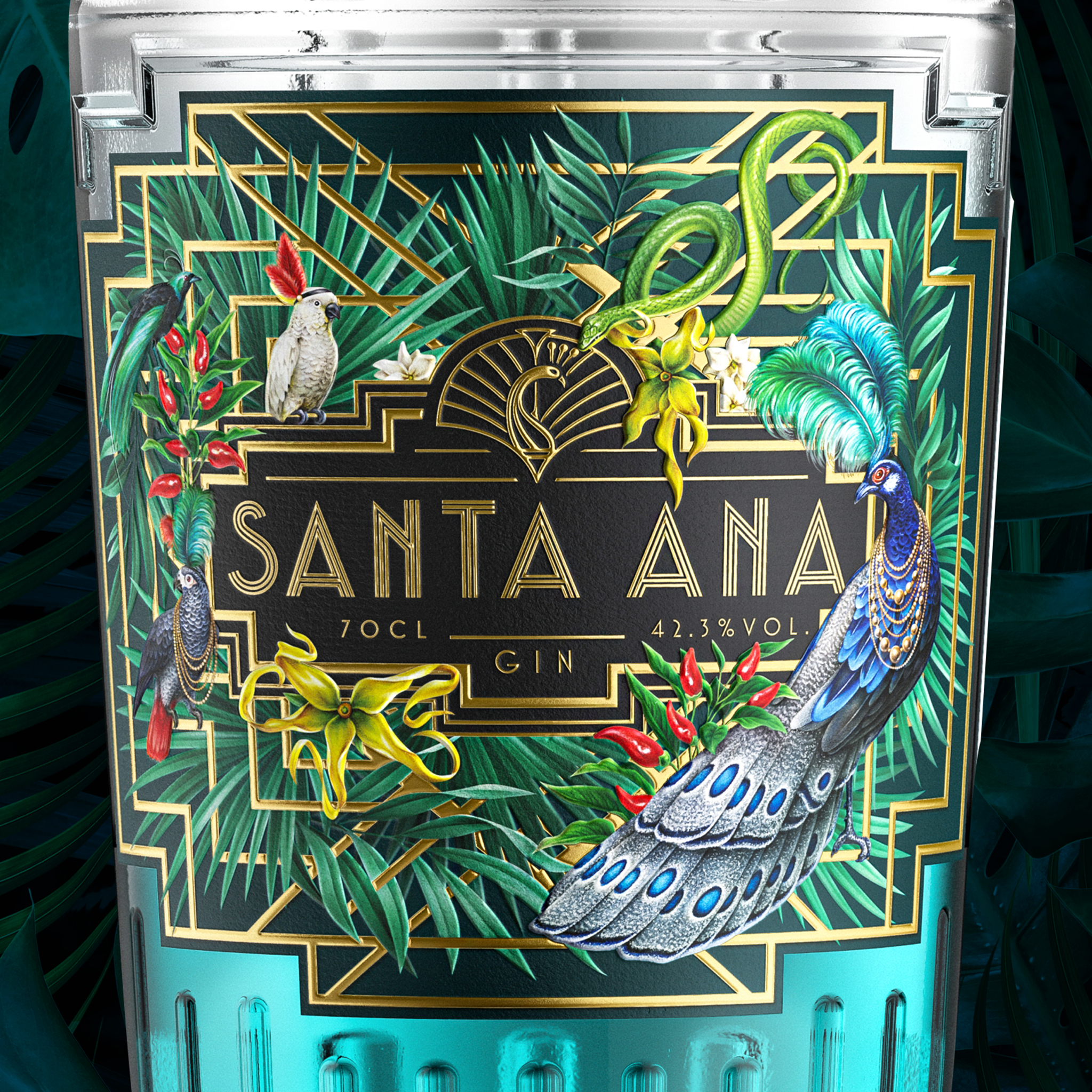
The project for Santa Ana Gin started with an in-depth research phase focused on the premium spirits market. I analyzed visual trends within the gin industry, studying competitors, bottle aesthetics, label compositions, and the visual language used by high-end distilleries.
Since gin is a product where the bottle plays a crucial role in attracting consumers, the research focused heavily on how branding, typography, and packaging design contribute to creating a strong shelf presence. The goal was to develop a visual identity that would feel distinctive, premium, and instantly recognizable.
DESIGN
DESIGN
Based on the insights gathered during research, I developed the complete visual branding for Santa Ana. The design phase focused on creating a strong and elegant identity that could translate perfectly onto the bottle and its packaging.
Special attention was given to typography, graphic balance, and iconography to reinforce the brand's character. Because a gin bottle must be visually striking, every design element was carefully crafted to enhance its aesthetic appeal and create a premium perception.
DEVELOPMENT
DEVELOPMENT
In the development phase, the branding system was refined and prepared for real-world application. The visual identity was adapted to the bottle label, packaging elements, and brand assets to ensure consistency and clarity across all touchpoints.
The final result is a cohesive branding system that enhances the product's visual impact, making the bottle not only a container but a key element of the brand experience.