

 RESEARCH
RESEARCH
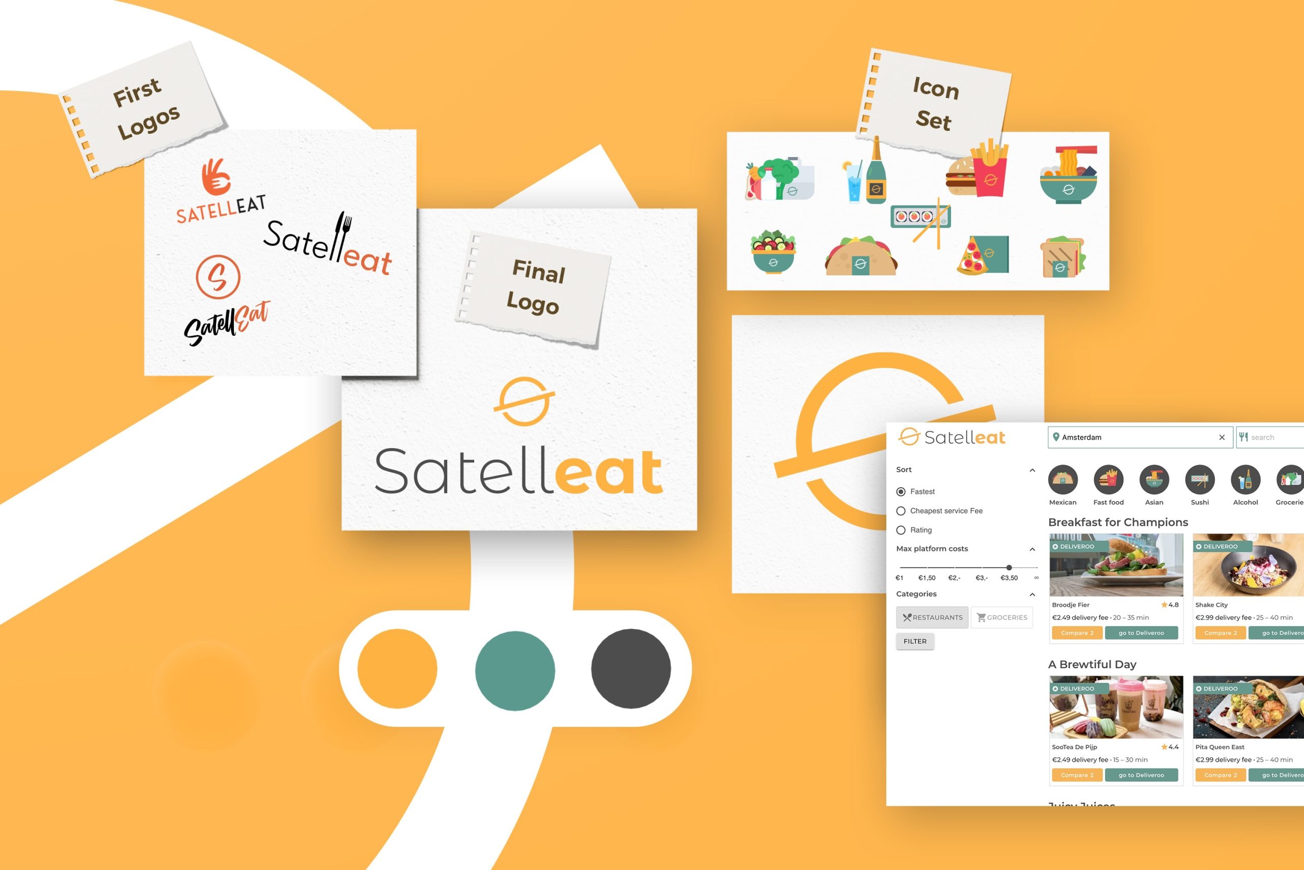
The project started with a research phase focused on understanding SATELLEAT’s positioning and communication goals. I analyzed the brand’s target audience, competitors, and the visual language commonly used in the sector. This process helped define a clear visual direction and identify the key elements needed to build a strong and recognizable brand identity for the website.
DESIGN
DESIGN
Based on the insights gathered during the research phase, I developed the visual identity for SATELLEAT. This included the creation of the brand’s graphic language and a set of essential icons designed specifically for the website. The goal was to ensure visual consistency, clarity, and a modern aesthetic that would effectively communicate the brand’s values while improving the user experience.
DEVELOPMENT
DEVELOPMENT
In the development phase, the visual concepts were refined and applied across the digital environment. The branding elements and icon system were integrated into the website design, ensuring a cohesive and polished visual experience. Particular attention was given to maintaining consistency, usability, and aesthetic balance across all components of the interface.