Santa Ana Gin: branding & label
How I built the visual identity and label for a premium gin, from market research to the final packaging.
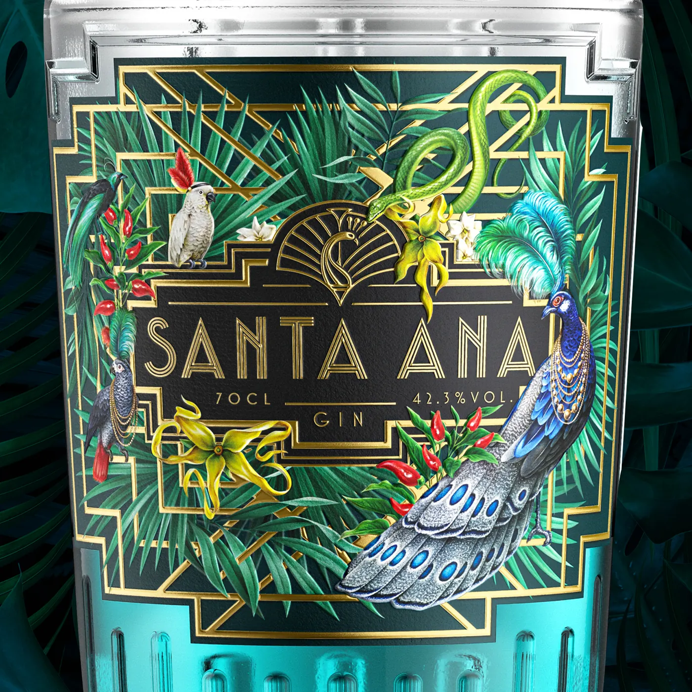 Santa Ana
Research
I analysed premium gin market trends, competitors and bottle and label design. A gin bottle has to be chosen in seconds, among dozens of others on the same shelf.
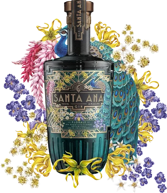
Design
The identity rests on typography, graphic balance and iconography. Every element was designed for how it reads on the bottle and from a distance.
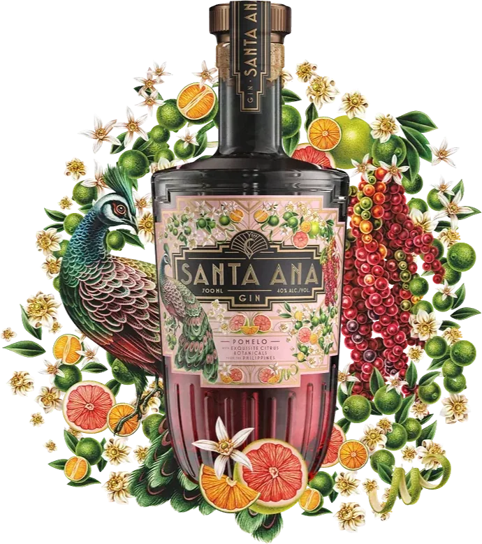
Development
I adapted the identity to the label, packaging and brand assets, keeping it consistent across every touchpoint.
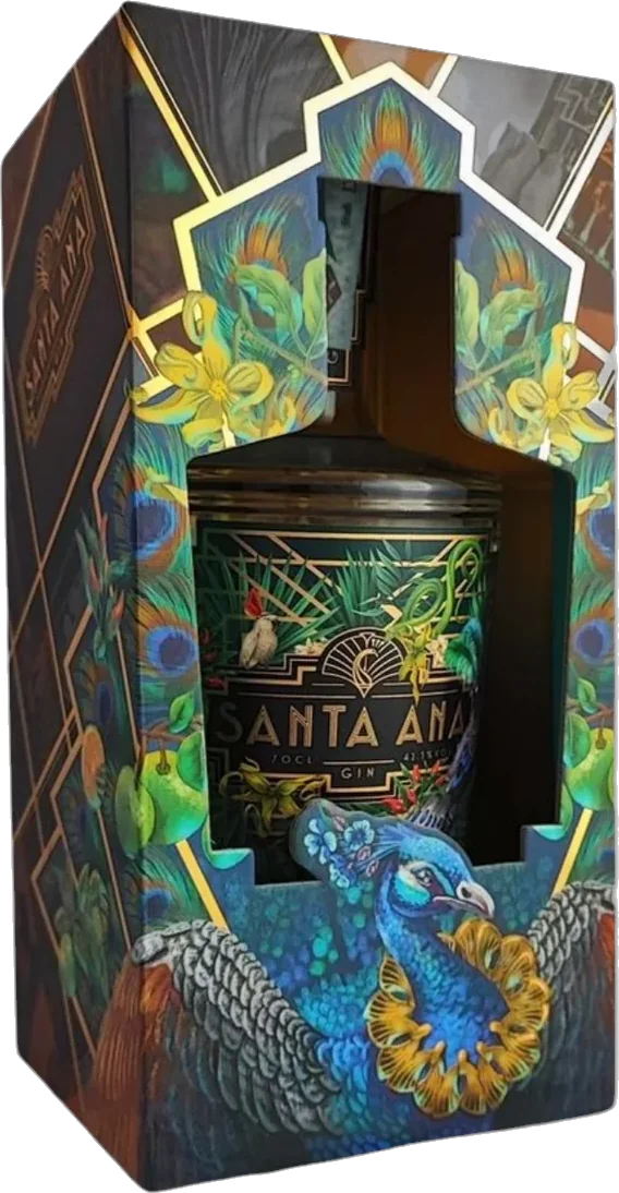
On shelves worldwide
Today Santa Ana Gin is distributed worldwide. The identity was built to stand out on any shelf, and the graphic system extends to new variants of the range without losing consistency.
Have a project in mind?
Tell me what you need and I will reply with a tailored proposal and a clear quote.